hives for humanity
A reimagining branding project for an existing organization, Hives for Humanity.
Branding
Visual Design
User Research
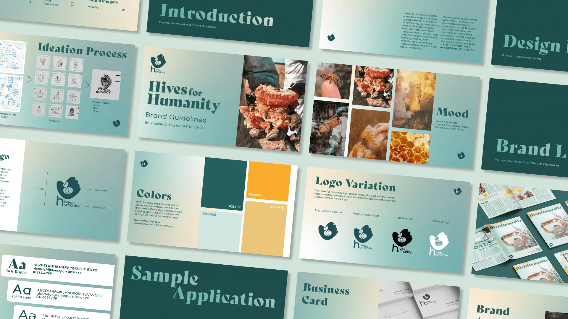
This project includes a complete brand guidelines, logo, brand application, business card, letterhead, brochure, social media contents, and a web page mock ups.
Duration
May-August 2023
Tools
Adobe Illustrators
Adobe Photoshop
Procreate
Who is this project designed for?
client
Hives for Humanity (Hives) is a non-profit organization that aims to create connections in the community, through nature, bees, and the culture of the hive. Through hands-on programs, Hives promotes inclusivity, environmental stewardship, and community resilience by bringing people together to care for bees and create shared spaces.
My goals for this project is to create friendly and approachable branding for Hives, as one of their goals is to create hives for people by using nature and bees.
On the first 2 weeks of the project, I spent time on researching the client vision and goals, their target audience, and competitors in the industry. After that I brainstormed some keywords that can be effectively used to describe Hives for Humanities’ identities.
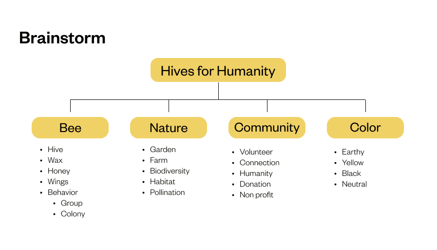
Keywords diagram made during brainstorming session
Brainstorming
research process
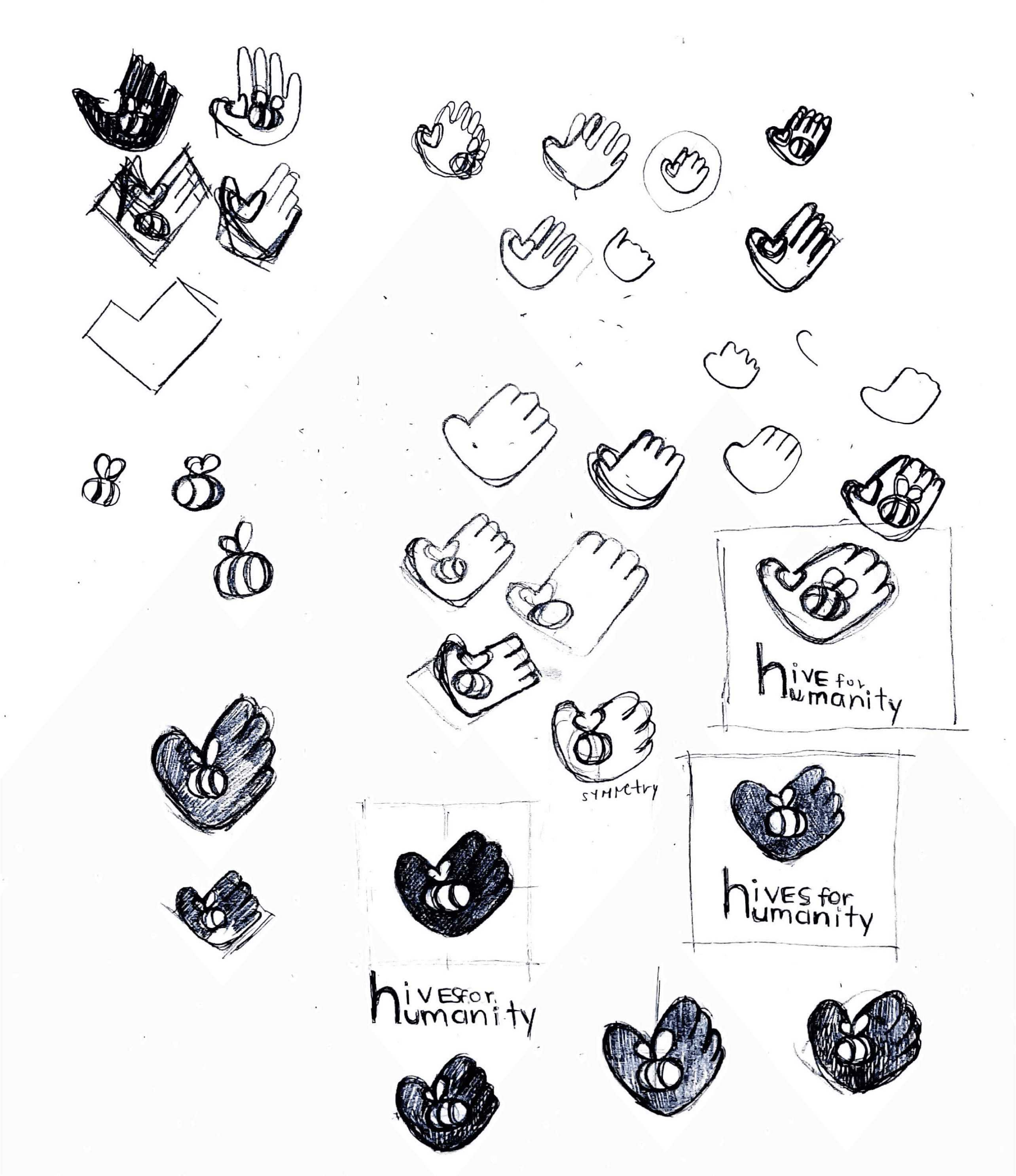
Iterating process on the chosen design
Initial logo iterations
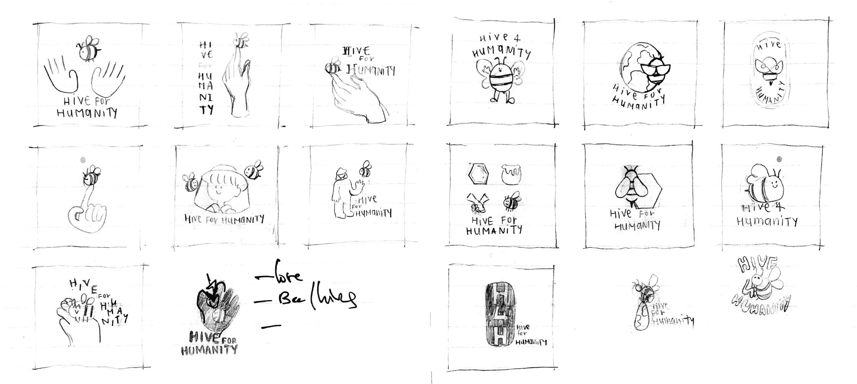
During week 3 and 4, I have started the sketching process of the logo. I focused on integrating human and bees into the logo to convey the organization’s goal, create connection in community through nature and bees. After I decided on one design, I continued on making more iterations and modifications on the logo.
Design Process
sketching
The logo draws its inspiration from Hives for Humanity's core mission, aiming to connect individuals through the nature and the bees. The logo shaped like a hand forming a heart, it symbolizes human connection, with the bees nestled within the negative spaces representing the organization's focal elements.
Selected Logo and Branding
final product
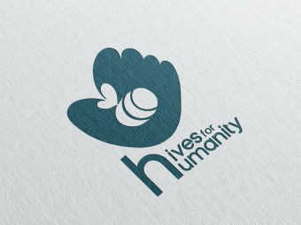

Original logo
Rebranded logo
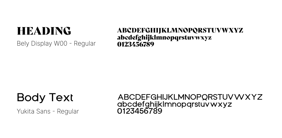
The primary typeface for headings are Bely Display and primary typeface for body text is Yukita Sans. I have paired sans-serif and serif typefaces to create visual contrast and enhance the visual hierarchy as Bely Display has sharp and angular edges contrasting with Yukita Sans that is round and softer edges. While Bely Display gives out professional and elegant branding, Yukita Sans helps create a friendly and approachable personality for the brand.
The Essence of Brand Identity Through Type
Naturistic Palette Symbolizing Community and Connection

The main color palette of Hives for Humanity predominantly consists of naturalistic hues, which aligned effectively with the organization's vision. These colors facilitate connections through the help of nature and bees.

Reflection
Through this project, I was able to know more about design knowledge, gave me a better understanding on how the design process works, and how to develop a branding based on the organization’s visions and the users’ pain point.
If I am going to revisit this project, I will focus more on researching the organization and conduct an interview with the Hives for Humanity’s team to gain a better insight about their organization. I would also look more into improving the font choices and the pairings.